Nashville Riverfront
Client: Metro Parks / Hargreaves Associates
Changing the landscape of a city while reconnecting it with its past.
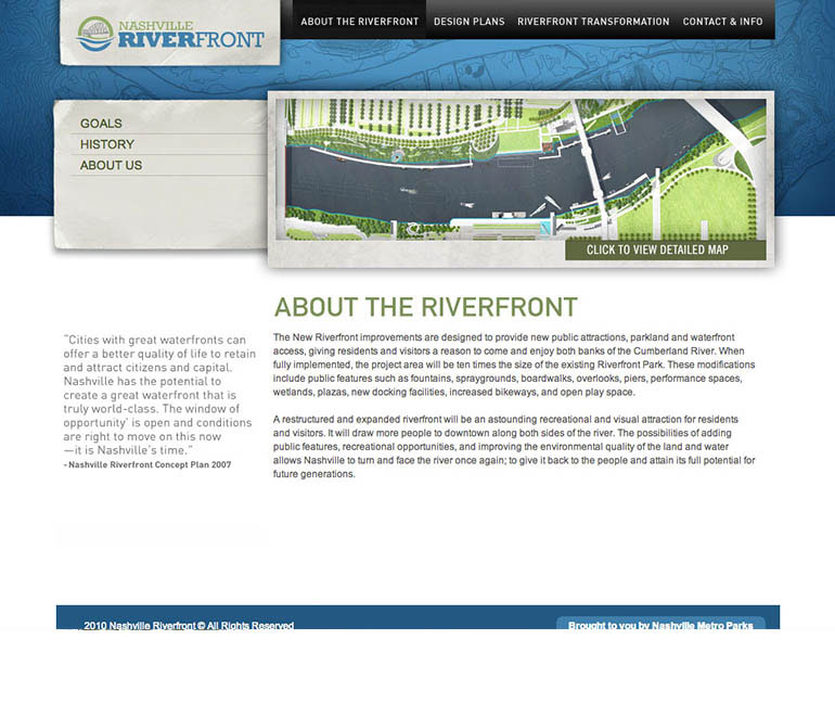
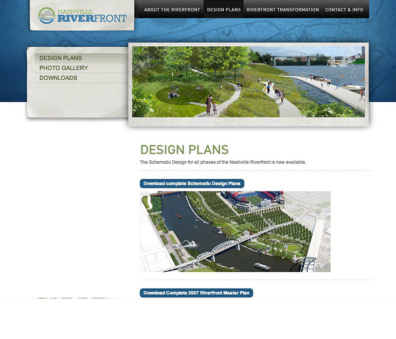
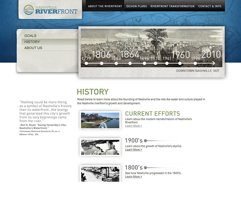
Mayor Karl Dean, Metro Parks, and MDHA had a vision a few years ago to transform Nashville's Riverfront and reconnect the city to the river. A plan began to take shape in 2009. After it was presented, Hargreaves & Associates contacted us and we started working on helping them brand this initiative.
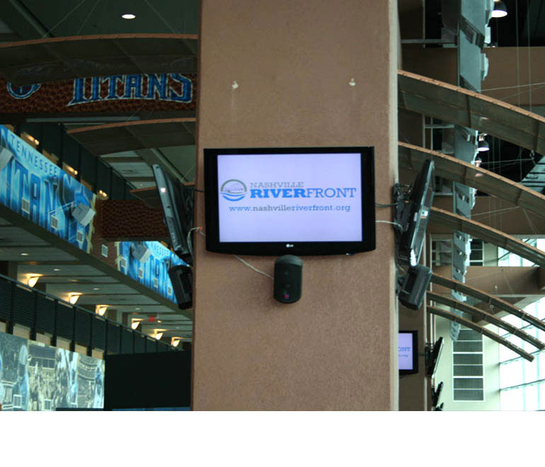
The project became a full service project which included the logo, website, presentation materials and informational signage.
The solution and results:
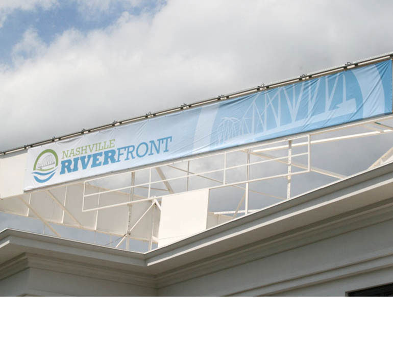
Many marks were submitted and there a lot of good options. However, the mark that was chosen met the approval of Metro Parks, MDHA, several focus groups and the Mayor. The color selections were a big part of the process for the brand. Naturally, blue represents water. However, green communicated the new landscape's connection with the water and the environmentally minded strategy of the construction. The bridge is used to connect both sides of the river together.
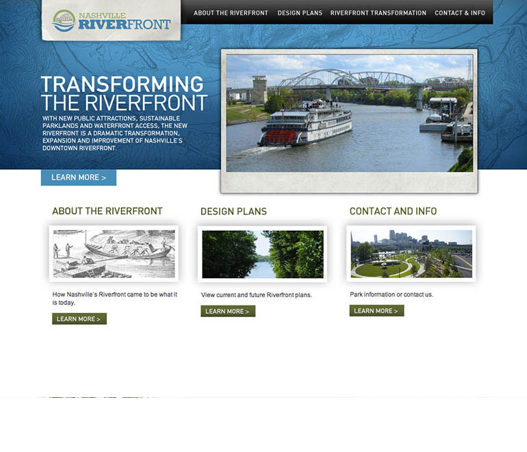
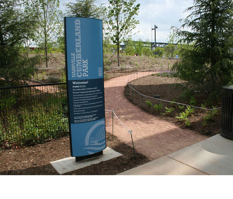
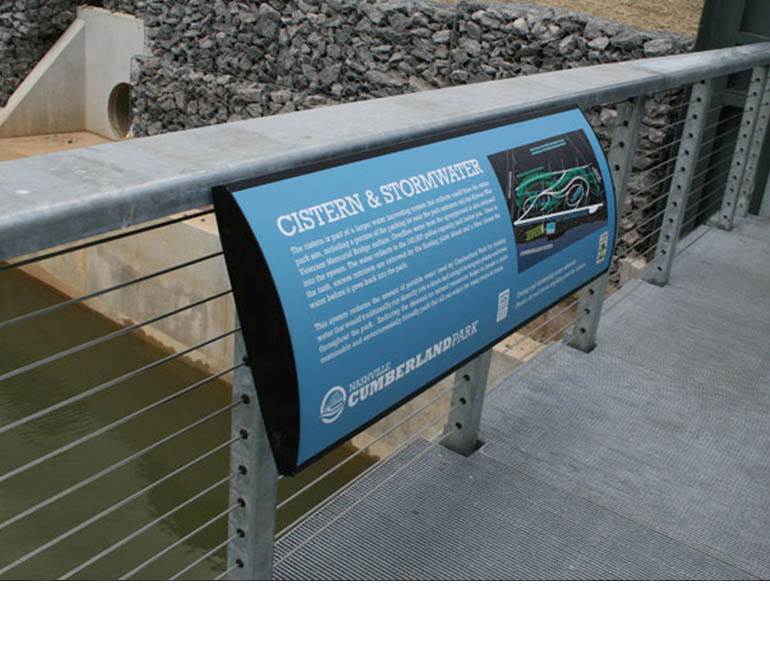
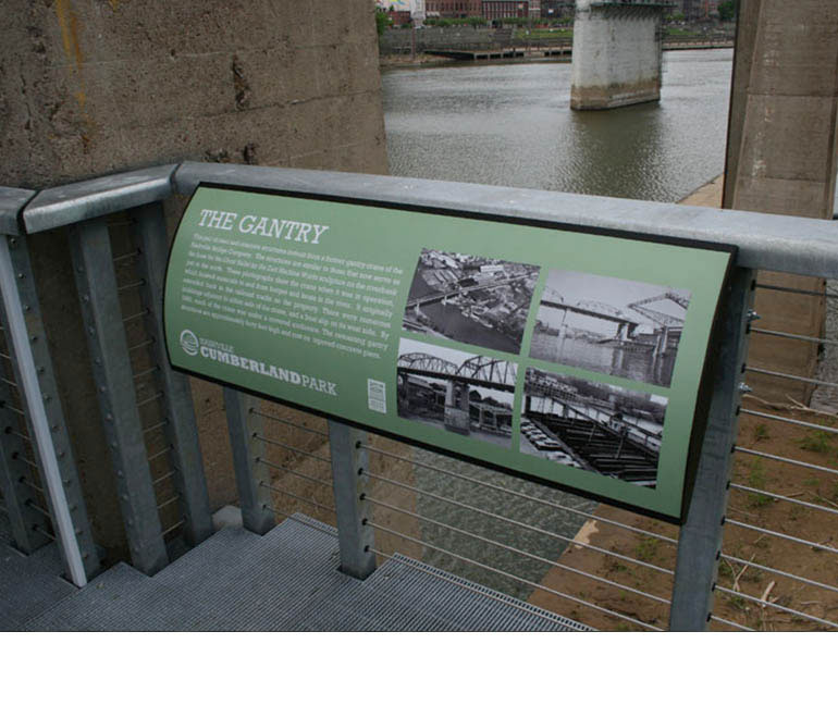
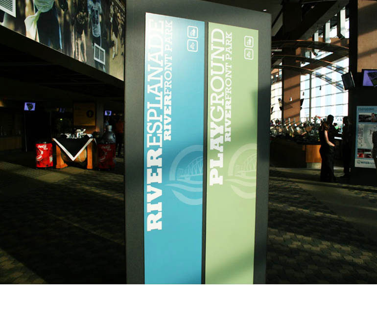
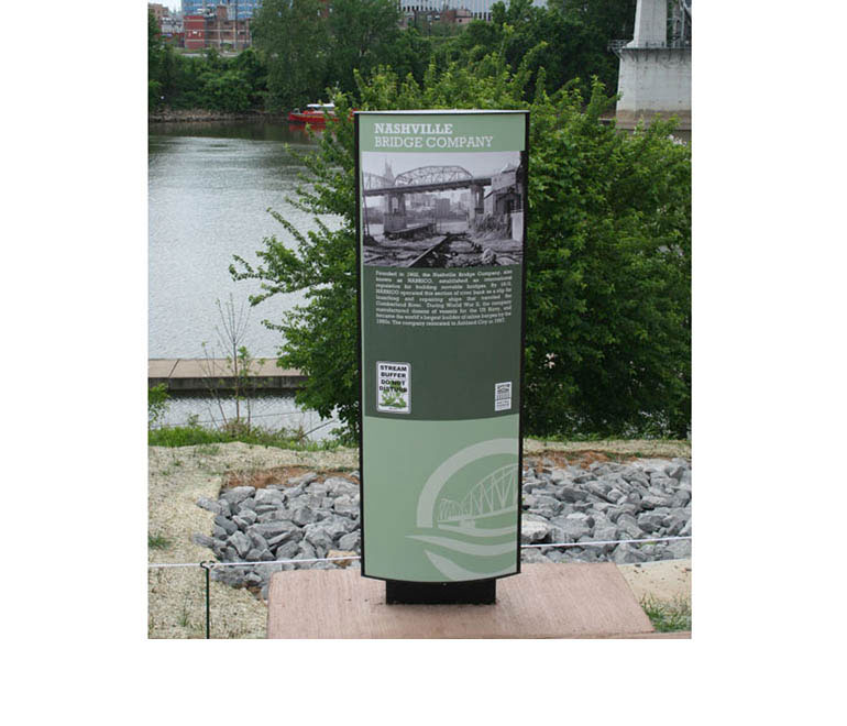
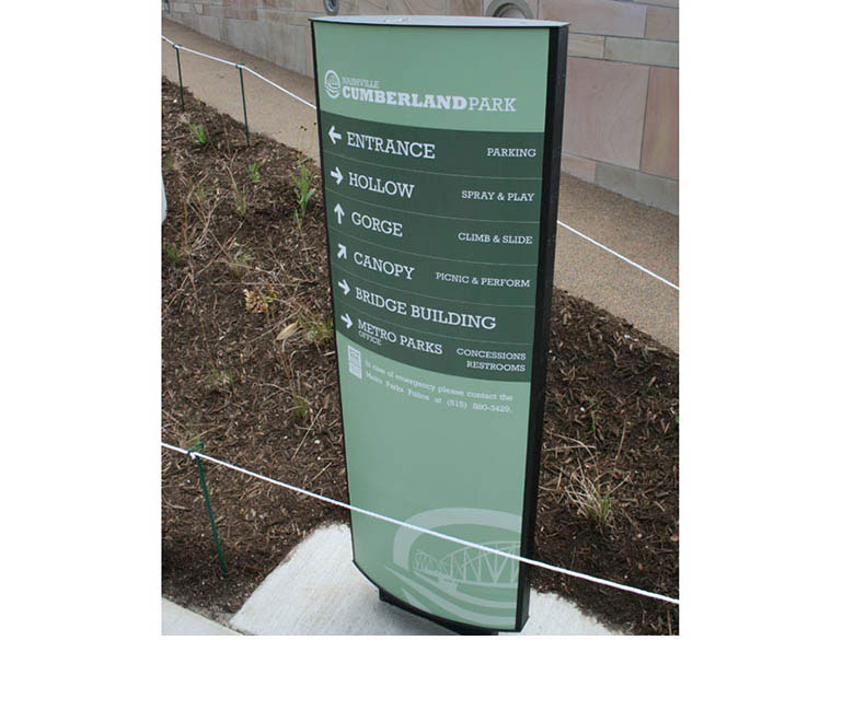
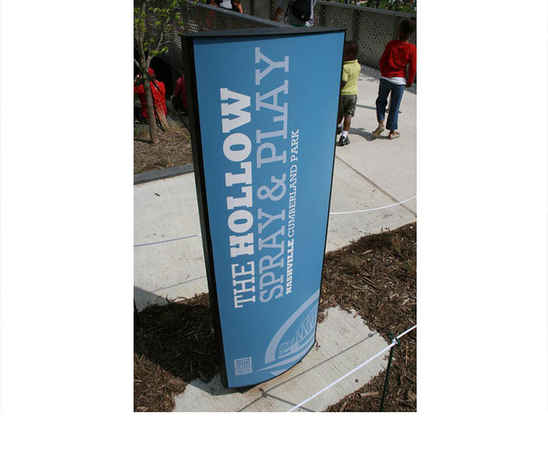
The Site and Signage
Both the site and park signage really reflected the brand well. It was exciting to see how the pieces came together and when the park opened, it was amazing to see the signage come to life.