Atrevis
Client: Healthcare Realty / Atrevis

A business solutions/software design company that doesn't act or think like one.
Atrevis designs and develops effective business solutions for different industries. What makes them so unique is their process. They take a handcrafted approach to technological problem solving. They start by forming the solution around the individual needs of the business. Another part of the approach is the consideration for the client and the management of the project. Atrevis is about guiding and giving direction to it's clients, helping them find the best solution that's right for them.
This is a new division of Healthcare Realty. They needed a new brand in order to market independently and pursue new opportunities bringing in new revenue streams. This brand's purpose is to spark interest.

The solution and results:
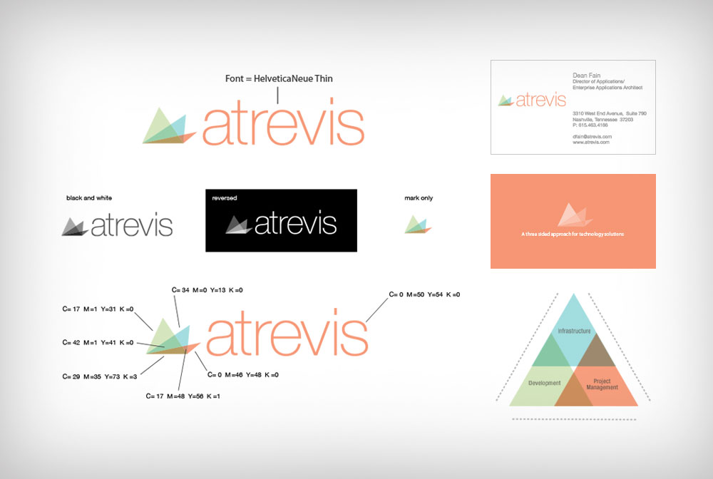
We kept thinking about terms like "being unique", and "approachable technology". We wanted Atrevis to be different but with a purpose. We also helped the client come up with the name. We did extensive research with the client. The name Atrevis stems from the triangle which was appropriate because they use a "three-sided" approach when forming solutions. Therefore, the triangle and the number 3 became important in the design of the mark. The colors came into play as well. The three triangles are transparent to represent the layers of the process, the connection of all of the pieces, and the transparency of their process with their clients.
The new brand is already making traction in the marketplace. The client has been told by several large companies that the logo actually impressed them to want to know more about them which has generated many new leads and opportunities. We look forward to continuing the brand journey with them.
